Choosing a Wedding Color Palette
Choosing a color palette for your wedding can set the tone for the entire event. You might want to consider a palette that complements the natural beauty of the area and the season in which your wedding will take place.
 Here are a few ideas:
1. Coastal Elegance
Colors: Soft blues, sandy beige, seafoam green, and crisp white.
Vibe: Elegant and relaxed, perfect for a beachside or waterfront wedding.
2. Classic Romance
Colors: Blush pink, deep burgundy, champagne gold, and ivory.
Vibe: Timeless and romantic, ideal for a traditional wedding with a touch of glamour.
3. Garden Party
Colors: Sage green, lavender, peach, and cream.
Vibe: Fresh and natural, great for an outdoor or garden setting.
4. Modern Minimalist
Colors: Charcoal gray, soft white, olive green, and metallic accents.
Vibe: Sleek and sophisticated, perfect for a contemporary wedding.
5. Autumn Harvest (if you're planning a fall wedding)
Colors: Rust orange, deep plum, mustard yellow, and warm brown.
Vibe: Cozy and rich, reflecting the beautiful fall foliage of Long Island.
Would you like more details on any of these palettes or suggestions for other themes?
When selecting a color palette for your wedding, each color can carry a specific meaning or symbolism, which can add depth and significance to your choices. Here’s a breakdown of common wedding colors and their traditional meanings:
Neutral Colors
White: Purity, innocence, new beginnings.
Ivory: Elegance, sophistication, warmth.
Beige: Simplicity, calmness, tradition.
Gray: Neutrality, balance, modernity.
Warm Colors
Red: Passion, love, excitement. It’s a bold choice, often symbolizing deep affection.
Pink: Romance, sweetness, femininity. Soft pinks can evoke feelings of tenderness, while brighter pinks are lively and fun.
Orange: Energy, enthusiasm, creativity. It’s a vibrant choice that can bring warmth and happiness to your wedding.
Yellow: Joy, happiness, positivity. Yellow is often associated with sunshine and cheerfulness.
Gold: Wealth, luxury, prosperity. Gold adds a touch of opulence and grandeur to a wedding palette.
Cool Colors
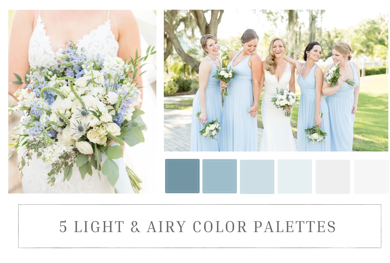
Blue: Peace, trust, stability. Blue is often associated with calmness and serenity.
Green: Nature, growth, harmony. It represents renewal and freshness, making it a great choice for an outdoor or garden wedding.
Purple: Royalty, luxury, spirituality. Deep purples are rich and dramatic, while lighter shades like lavender are more romantic and delicate.
Turquoise/Teal: Clarity, communication, balance. These shades are refreshing and invigorating, often used for a modern or beach-themed wedding.
Here are a few ideas:
1. Coastal Elegance
Colors: Soft blues, sandy beige, seafoam green, and crisp white.
Vibe: Elegant and relaxed, perfect for a beachside or waterfront wedding.
2. Classic Romance
Colors: Blush pink, deep burgundy, champagne gold, and ivory.
Vibe: Timeless and romantic, ideal for a traditional wedding with a touch of glamour.
3. Garden Party
Colors: Sage green, lavender, peach, and cream.
Vibe: Fresh and natural, great for an outdoor or garden setting.
4. Modern Minimalist
Colors: Charcoal gray, soft white, olive green, and metallic accents.
Vibe: Sleek and sophisticated, perfect for a contemporary wedding.
5. Autumn Harvest (if you're planning a fall wedding)
Colors: Rust orange, deep plum, mustard yellow, and warm brown.
Vibe: Cozy and rich, reflecting the beautiful fall foliage of Long Island.
Would you like more details on any of these palettes or suggestions for other themes?
When selecting a color palette for your wedding, each color can carry a specific meaning or symbolism, which can add depth and significance to your choices. Here’s a breakdown of common wedding colors and their traditional meanings:
Neutral Colors
White: Purity, innocence, new beginnings.
Ivory: Elegance, sophistication, warmth.
Beige: Simplicity, calmness, tradition.
Gray: Neutrality, balance, modernity.
Warm Colors
Red: Passion, love, excitement. It’s a bold choice, often symbolizing deep affection.
Pink: Romance, sweetness, femininity. Soft pinks can evoke feelings of tenderness, while brighter pinks are lively and fun.
Orange: Energy, enthusiasm, creativity. It’s a vibrant choice that can bring warmth and happiness to your wedding.
Yellow: Joy, happiness, positivity. Yellow is often associated with sunshine and cheerfulness.
Gold: Wealth, luxury, prosperity. Gold adds a touch of opulence and grandeur to a wedding palette.
Cool Colors
Blue: Peace, trust, stability. Blue is often associated with calmness and serenity.
Green: Nature, growth, harmony. It represents renewal and freshness, making it a great choice for an outdoor or garden wedding.
Purple: Royalty, luxury, spirituality. Deep purples are rich and dramatic, while lighter shades like lavender are more romantic and delicate.
Turquoise/Teal: Clarity, communication, balance. These shades are refreshing and invigorating, often used for a modern or beach-themed wedding.
 Earthy Tones
Brown: Stability, reliability, comfort. It’s a grounded color that can bring a sense of warmth and natural beauty.
Rust/Terracotta: Earthiness, warmth, resilience. These shades are popular for autumn weddings, evoking a cozy, rustic atmosphere.
Metallics
Silver: Glamour, sophistication, modernity. Silver can be used to add a sleek, elegant touch.
Copper: Warmth, earthiness, vintage charm. Copper is a trendy choice that pairs well with rustic or industrial themes.
When creating a palette, consider combining colors that complement each other not only visually but also in meaning. For example, pairing blue (trust and stability) with white (purity and new beginnings) could symbolize the foundation of a strong and enduring marriage.
If you have a specific theme or personal story, you might choose colors that reflect those elements. Would you like to explore how different palettes can align with the meaning or vibe you're hoping to create for your wedding?
When selecting a color palette for a wedding, there are several frequently asked questions (FAQs) that can help guide your decision-making process. Here are some common questions and their answers:
1. How Do I Choose a Wedding Color Palette?
Inspiration Sources: Start by considering your venue, the season, and any personal preferences or themes. You can also find inspiration from fashion, nature, or your favorite colors.
Mood and Atmosphere: Think about the mood you want to create—romantic, modern, rustic, etc.—and choose colors that reflect that vibe.
Use Color Tools: Online color palettes or design tools like Pinterest can help you visualize different combinations.
2. How Many Colors Should Be in a Wedding Palette?
Primary and Accent Colors: A typical wedding palette includes 2-3 main colors and 1-2 accent colors. However, some couples may prefer a monochromatic look with different shades of a single color.
Balance: Make sure the colors complement each other without clashing or overwhelming the space.
3. Should the Season Influence My Color Choices?
Seasonal Considerations: Yes, the season can greatly influence your color choices. For example, pastels are popular for spring, vibrant hues for summer, earthy tones for fall, and rich, deep colors for winter.
Flexibility: While seasonal colors are traditional, you can break the rules and choose colors that best suit your personal style.
4. How Can I Incorporate My Wedding Colors?
Décor: Use your color palette in flowers, table settings, linens, and other décor elements.
Attire: Bridesmaid dresses, groomsmen ties, and accessories can reflect your chosen colors.
Stationery: Invitations, place cards, and other printed materials are also great places to incorporate your color palette.
5. Can I Use More Than One Shade of a Color?
Monochromatic Schemes: Yes, using various shades of a single color can add depth and sophistication. For example, a palette of different blues can create a cohesive and elegant look.
Ombre Effect: An ombre effect, where colors gradually change from light to dark, is another creative way to use multiple shades.
6. What if I Can’t Decide on a Palette?
Narrow It Down: Start by choosing one or two colors you absolutely love and build from there.
Consult a Designer: If you're still unsure, consider consulting a wedding planner or designer who can provide professional guidance.
Test It Out: Create mood boards or sample arrangements to see how the colors look together in real life.
7. Do I Have to Stick to My Color Palette?
Flexibility: While it’s important to maintain a cohesive look, don’t be afraid to adjust your palette slightly if you find something that works better.
Personal Touches: Incorporating personal elements or favorite items that don’t perfectly match the palette can make your wedding more unique and meaningful.
8. How Do I Make Sure My Colors Work Well Together?
Color Theory: Understanding basic color theory can help. Complementary colors (opposite on the color wheel) work well together, as do analogous colors (next to each other on the wheel).
Test Swatches: Always test color combinations in the context of your venue, lighting, and overall wedding theme to ensure they look good together.
9. Can My Palette Include Metallics or Neutrals?
Accents: Metallics like gold, silver, or rose gold, as well as neutrals like white, beige, or gray, can add elegance and balance to your palette.
Versatility: These colors often serve as great accent colors and can be incorporated in everything from table settings to attire.
10. What Are Some Popular Wedding Color Palettes?
Classic: Navy, blush, and gold.
Romantic: Dusty rose, sage green, and champagne.
Modern: Black, white, and greenery.
Rustic: Burgundy, orange, and brown.
Tropical: Coral, turquoise, and palm green.
Do you have specific colors in mind for your wedding, or are you still deciding?
Earthy Tones
Brown: Stability, reliability, comfort. It’s a grounded color that can bring a sense of warmth and natural beauty.
Rust/Terracotta: Earthiness, warmth, resilience. These shades are popular for autumn weddings, evoking a cozy, rustic atmosphere.
Metallics
Silver: Glamour, sophistication, modernity. Silver can be used to add a sleek, elegant touch.
Copper: Warmth, earthiness, vintage charm. Copper is a trendy choice that pairs well with rustic or industrial themes.
When creating a palette, consider combining colors that complement each other not only visually but also in meaning. For example, pairing blue (trust and stability) with white (purity and new beginnings) could symbolize the foundation of a strong and enduring marriage.
If you have a specific theme or personal story, you might choose colors that reflect those elements. Would you like to explore how different palettes can align with the meaning or vibe you're hoping to create for your wedding?
When selecting a color palette for a wedding, there are several frequently asked questions (FAQs) that can help guide your decision-making process. Here are some common questions and their answers:
1. How Do I Choose a Wedding Color Palette?
Inspiration Sources: Start by considering your venue, the season, and any personal preferences or themes. You can also find inspiration from fashion, nature, or your favorite colors.
Mood and Atmosphere: Think about the mood you want to create—romantic, modern, rustic, etc.—and choose colors that reflect that vibe.
Use Color Tools: Online color palettes or design tools like Pinterest can help you visualize different combinations.
2. How Many Colors Should Be in a Wedding Palette?
Primary and Accent Colors: A typical wedding palette includes 2-3 main colors and 1-2 accent colors. However, some couples may prefer a monochromatic look with different shades of a single color.
Balance: Make sure the colors complement each other without clashing or overwhelming the space.
3. Should the Season Influence My Color Choices?
Seasonal Considerations: Yes, the season can greatly influence your color choices. For example, pastels are popular for spring, vibrant hues for summer, earthy tones for fall, and rich, deep colors for winter.
Flexibility: While seasonal colors are traditional, you can break the rules and choose colors that best suit your personal style.
4. How Can I Incorporate My Wedding Colors?
Décor: Use your color palette in flowers, table settings, linens, and other décor elements.
Attire: Bridesmaid dresses, groomsmen ties, and accessories can reflect your chosen colors.
Stationery: Invitations, place cards, and other printed materials are also great places to incorporate your color palette.
5. Can I Use More Than One Shade of a Color?
Monochromatic Schemes: Yes, using various shades of a single color can add depth and sophistication. For example, a palette of different blues can create a cohesive and elegant look.
Ombre Effect: An ombre effect, where colors gradually change from light to dark, is another creative way to use multiple shades.
6. What if I Can’t Decide on a Palette?
Narrow It Down: Start by choosing one or two colors you absolutely love and build from there.
Consult a Designer: If you're still unsure, consider consulting a wedding planner or designer who can provide professional guidance.
Test It Out: Create mood boards or sample arrangements to see how the colors look together in real life.
7. Do I Have to Stick to My Color Palette?
Flexibility: While it’s important to maintain a cohesive look, don’t be afraid to adjust your palette slightly if you find something that works better.
Personal Touches: Incorporating personal elements or favorite items that don’t perfectly match the palette can make your wedding more unique and meaningful.
8. How Do I Make Sure My Colors Work Well Together?
Color Theory: Understanding basic color theory can help. Complementary colors (opposite on the color wheel) work well together, as do analogous colors (next to each other on the wheel).
Test Swatches: Always test color combinations in the context of your venue, lighting, and overall wedding theme to ensure they look good together.
9. Can My Palette Include Metallics or Neutrals?
Accents: Metallics like gold, silver, or rose gold, as well as neutrals like white, beige, or gray, can add elegance and balance to your palette.
Versatility: These colors often serve as great accent colors and can be incorporated in everything from table settings to attire.
10. What Are Some Popular Wedding Color Palettes?
Classic: Navy, blush, and gold.
Romantic: Dusty rose, sage green, and champagne.
Modern: Black, white, and greenery.
Rustic: Burgundy, orange, and brown.
Tropical: Coral, turquoise, and palm green.
Do you have specific colors in mind for your wedding, or are you still deciding?
Here are a few ideas:
1. Coastal Elegance
Colors: Soft blues, sandy beige, seafoam green, and crisp white.
Vibe: Elegant and relaxed, perfect for a beachside or waterfront wedding.
2. Classic Romance
Colors: Blush pink, deep burgundy, champagne gold, and ivory.
Vibe: Timeless and romantic, ideal for a traditional wedding with a touch of glamour.
3. Garden Party
Colors: Sage green, lavender, peach, and cream.
Vibe: Fresh and natural, great for an outdoor or garden setting.
4. Modern Minimalist
Colors: Charcoal gray, soft white, olive green, and metallic accents.
Vibe: Sleek and sophisticated, perfect for a contemporary wedding.
5. Autumn Harvest (if you're planning a fall wedding)
Colors: Rust orange, deep plum, mustard yellow, and warm brown.
Vibe: Cozy and rich, reflecting the beautiful fall foliage of Long Island.
Would you like more details on any of these palettes or suggestions for other themes?
When selecting a color palette for your wedding, each color can carry a specific meaning or symbolism, which can add depth and significance to your choices. Here’s a breakdown of common wedding colors and their traditional meanings:
Neutral Colors
White: Purity, innocence, new beginnings.
Ivory: Elegance, sophistication, warmth.
Beige: Simplicity, calmness, tradition.
Gray: Neutrality, balance, modernity.
Warm Colors
Red: Passion, love, excitement. It’s a bold choice, often symbolizing deep affection.
Pink: Romance, sweetness, femininity. Soft pinks can evoke feelings of tenderness, while brighter pinks are lively and fun.
Orange: Energy, enthusiasm, creativity. It’s a vibrant choice that can bring warmth and happiness to your wedding.
Yellow: Joy, happiness, positivity. Yellow is often associated with sunshine and cheerfulness.
Gold: Wealth, luxury, prosperity. Gold adds a touch of opulence and grandeur to a wedding palette.
Cool Colors
Blue: Peace, trust, stability. Blue is often associated with calmness and serenity.
Green: Nature, growth, harmony. It represents renewal and freshness, making it a great choice for an outdoor or garden wedding.
Purple: Royalty, luxury, spirituality. Deep purples are rich and dramatic, while lighter shades like lavender are more romantic and delicate.
Turquoise/Teal: Clarity, communication, balance. These shades are refreshing and invigorating, often used for a modern or beach-themed wedding.
Earthy Tones
Brown: Stability, reliability, comfort. It’s a grounded color that can bring a sense of warmth and natural beauty.
Rust/Terracotta: Earthiness, warmth, resilience. These shades are popular for autumn weddings, evoking a cozy, rustic atmosphere.
Metallics
Silver: Glamour, sophistication, modernity. Silver can be used to add a sleek, elegant touch.
Copper: Warmth, earthiness, vintage charm. Copper is a trendy choice that pairs well with rustic or industrial themes.
When creating a palette, consider combining colors that complement each other not only visually but also in meaning. For example, pairing blue (trust and stability) with white (purity and new beginnings) could symbolize the foundation of a strong and enduring marriage.
If you have a specific theme or personal story, you might choose colors that reflect those elements. Would you like to explore how different palettes can align with the meaning or vibe you're hoping to create for your wedding?
When selecting a color palette for a wedding, there are several frequently asked questions (FAQs) that can help guide your decision-making process. Here are some common questions and their answers:
1. How Do I Choose a Wedding Color Palette?
Inspiration Sources: Start by considering your venue, the season, and any personal preferences or themes. You can also find inspiration from fashion, nature, or your favorite colors.
Mood and Atmosphere: Think about the mood you want to create—romantic, modern, rustic, etc.—and choose colors that reflect that vibe.
Use Color Tools: Online color palettes or design tools like Pinterest can help you visualize different combinations.
2. How Many Colors Should Be in a Wedding Palette?
Primary and Accent Colors: A typical wedding palette includes 2-3 main colors and 1-2 accent colors. However, some couples may prefer a monochromatic look with different shades of a single color.
Balance: Make sure the colors complement each other without clashing or overwhelming the space.
3. Should the Season Influence My Color Choices?
Seasonal Considerations: Yes, the season can greatly influence your color choices. For example, pastels are popular for spring, vibrant hues for summer, earthy tones for fall, and rich, deep colors for winter.
Flexibility: While seasonal colors are traditional, you can break the rules and choose colors that best suit your personal style.
4. How Can I Incorporate My Wedding Colors?
Décor: Use your color palette in flowers, table settings, linens, and other décor elements.
Attire: Bridesmaid dresses, groomsmen ties, and accessories can reflect your chosen colors.
Stationery: Invitations, place cards, and other printed materials are also great places to incorporate your color palette.
5. Can I Use More Than One Shade of a Color?
Monochromatic Schemes: Yes, using various shades of a single color can add depth and sophistication. For example, a palette of different blues can create a cohesive and elegant look.
Ombre Effect: An ombre effect, where colors gradually change from light to dark, is another creative way to use multiple shades.
6. What if I Can’t Decide on a Palette?
Narrow It Down: Start by choosing one or two colors you absolutely love and build from there.
Consult a Designer: If you're still unsure, consider consulting a wedding planner or designer who can provide professional guidance.
Test It Out: Create mood boards or sample arrangements to see how the colors look together in real life.
7. Do I Have to Stick to My Color Palette?
Flexibility: While it’s important to maintain a cohesive look, don’t be afraid to adjust your palette slightly if you find something that works better.
Personal Touches: Incorporating personal elements or favorite items that don’t perfectly match the palette can make your wedding more unique and meaningful.
8. How Do I Make Sure My Colors Work Well Together?
Color Theory: Understanding basic color theory can help. Complementary colors (opposite on the color wheel) work well together, as do analogous colors (next to each other on the wheel).
Test Swatches: Always test color combinations in the context of your venue, lighting, and overall wedding theme to ensure they look good together.
9. Can My Palette Include Metallics or Neutrals?
Accents: Metallics like gold, silver, or rose gold, as well as neutrals like white, beige, or gray, can add elegance and balance to your palette.
Versatility: These colors often serve as great accent colors and can be incorporated in everything from table settings to attire.
10. What Are Some Popular Wedding Color Palettes?
Classic: Navy, blush, and gold.
Romantic: Dusty rose, sage green, and champagne.
Modern: Black, white, and greenery.
Rustic: Burgundy, orange, and brown.
Tropical: Coral, turquoise, and palm green.
Do you have specific colors in mind for your wedding, or are you still deciding?


Comments
Post a Comment